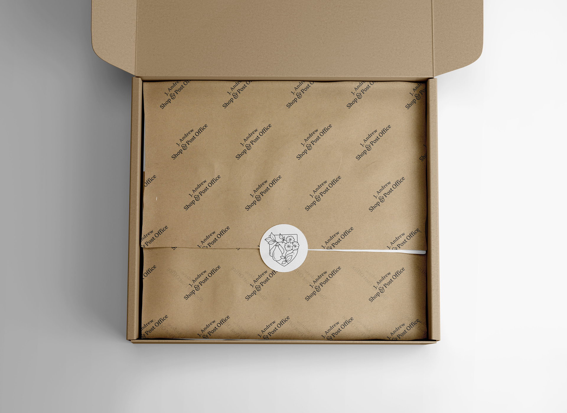
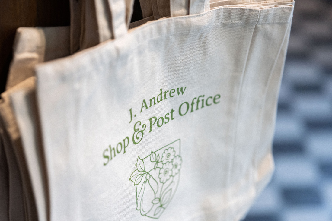
When creating the logo for J. Andrew Shop & Post Office, we found inspiration in a collection of early 20th century Art Nouveau tiles.
The tiles were discovered, around the original front door of the shop, during the renovations. They were hidden under layers of plaster and paint and too badly damaged to be saved, but we wanted to capture a sense of that period. So we searched far and wide for original tiles from the late 1800s and early 1900s, and found some beautiful examples.
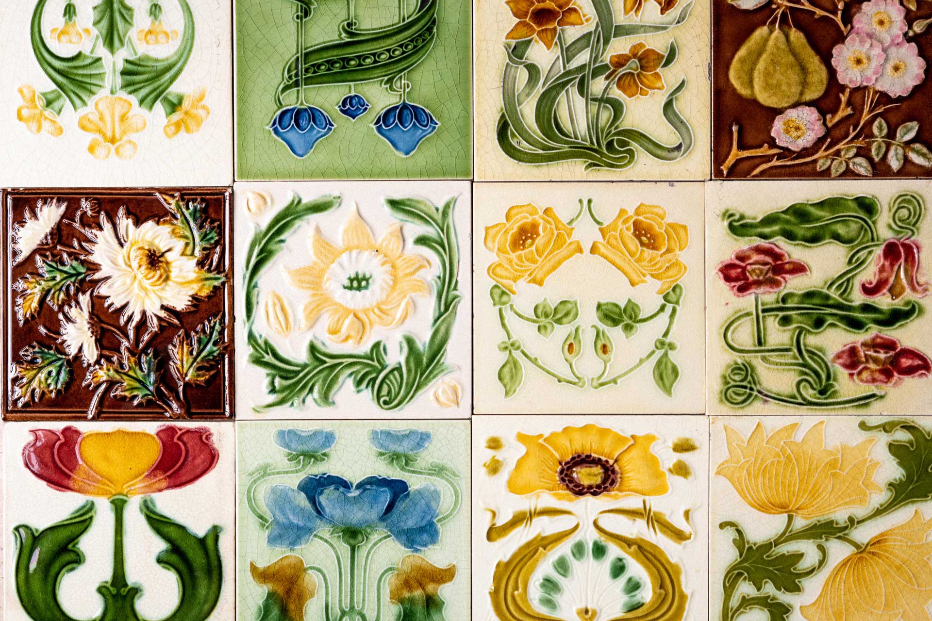
The tiles depicted elegant flowers and fruit, detailed in subtle colours and featuring curved and feminine lines. There were many different styles and colourways, but the one that grabbed our attention was an illustration of soft-green plump pears and pale-pink dog roses on a maroon background (see top-right, above). Its Arts and Crafts style and theme of bountiful nature was perfectly in-keeping with our traditional corner shop with its shelves crammed with locally produced goods.
After choosing the tile, its design was redrawn by hand and simplified in the process to make it suitable for a clean crest design with 21st-century overtones.
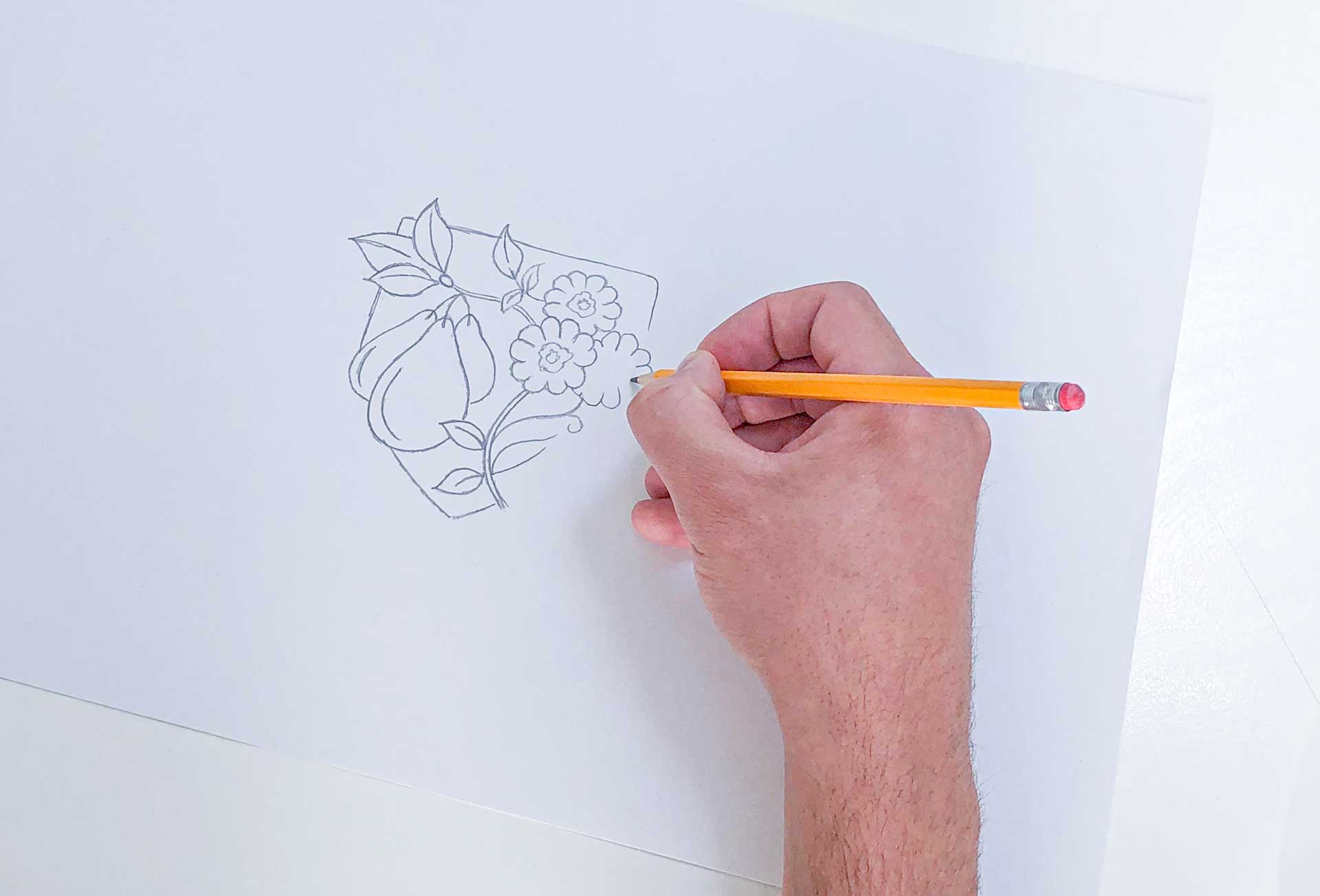
The drawing was then scanned and digitised so we could ascertain how it would work when used in different ways and on different materials – from shop signs to wrapping paper.
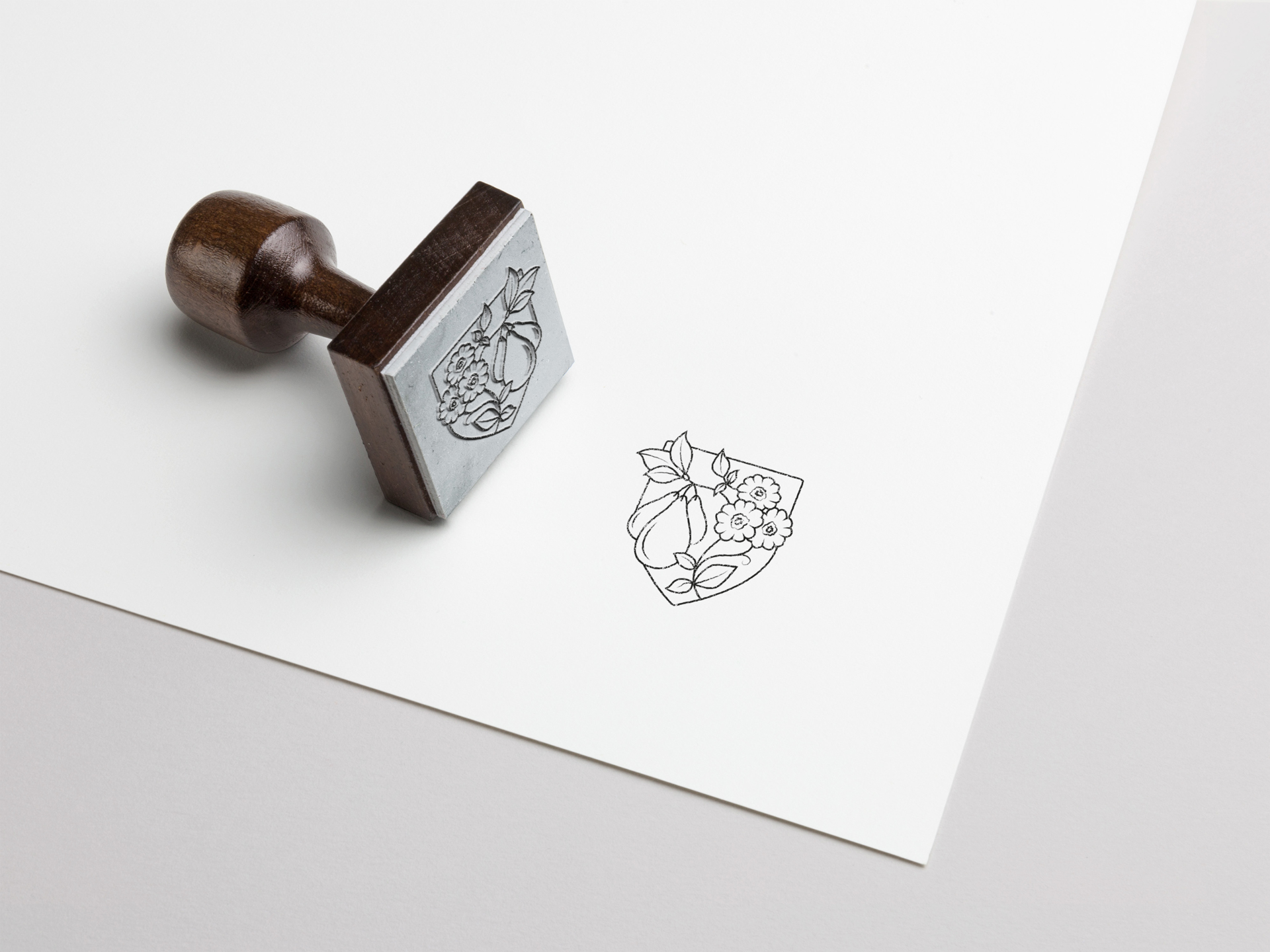
When we were sure it would work, the design was hand cut using the linocut process to give it a handcrafted authenticity that would represents the traditional-meets-21st-century nature of the shop.
Finally, the linocut was printed and rolled out for use on everything from bags to packaging.
